
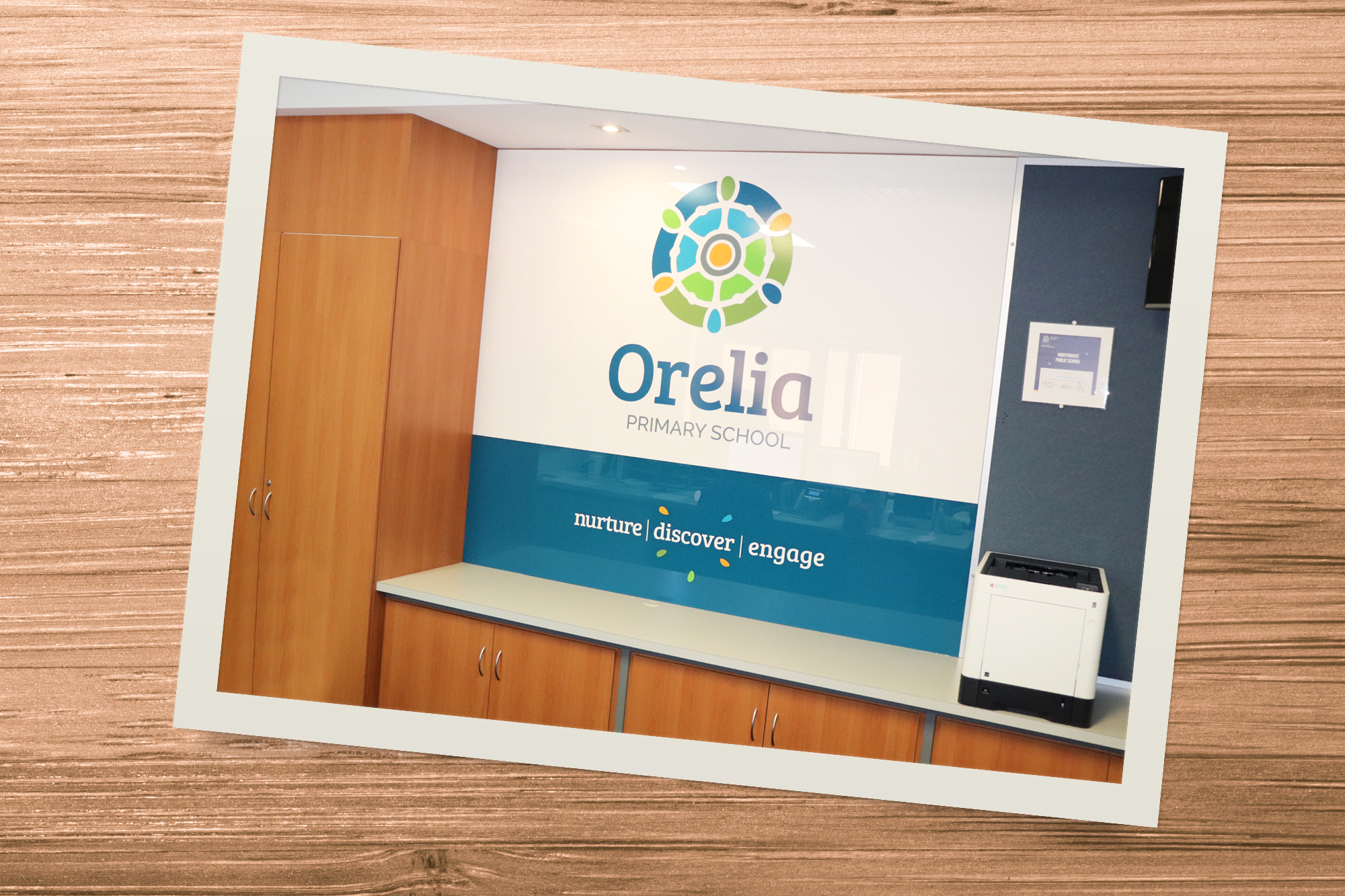



Having reached a milestone of 50 years serving their community, Orelia Primary School felt the time was right to refresh and revitalise the school brand.
The resulting brand is built from a set of organic circular shapes, with the school identified by the gold circle in the centre. This shape is encircled by the grey ring that reflects the strength of the school community. The next two layers of circles are split in half and are an interpretation of the local environment with the blues reflecting ocean and greens reflecting land. The inner circles also represent the students’ lives now and the outer circles the futures they look to over the horizon. The diverse range of coloured ovals at the edge of the icon represent the diversity of students.
As a nod to history and the previous brand, the white shapes also represent the wheel of a tall ship, a symbol of guidance on a journey of life and discovery.
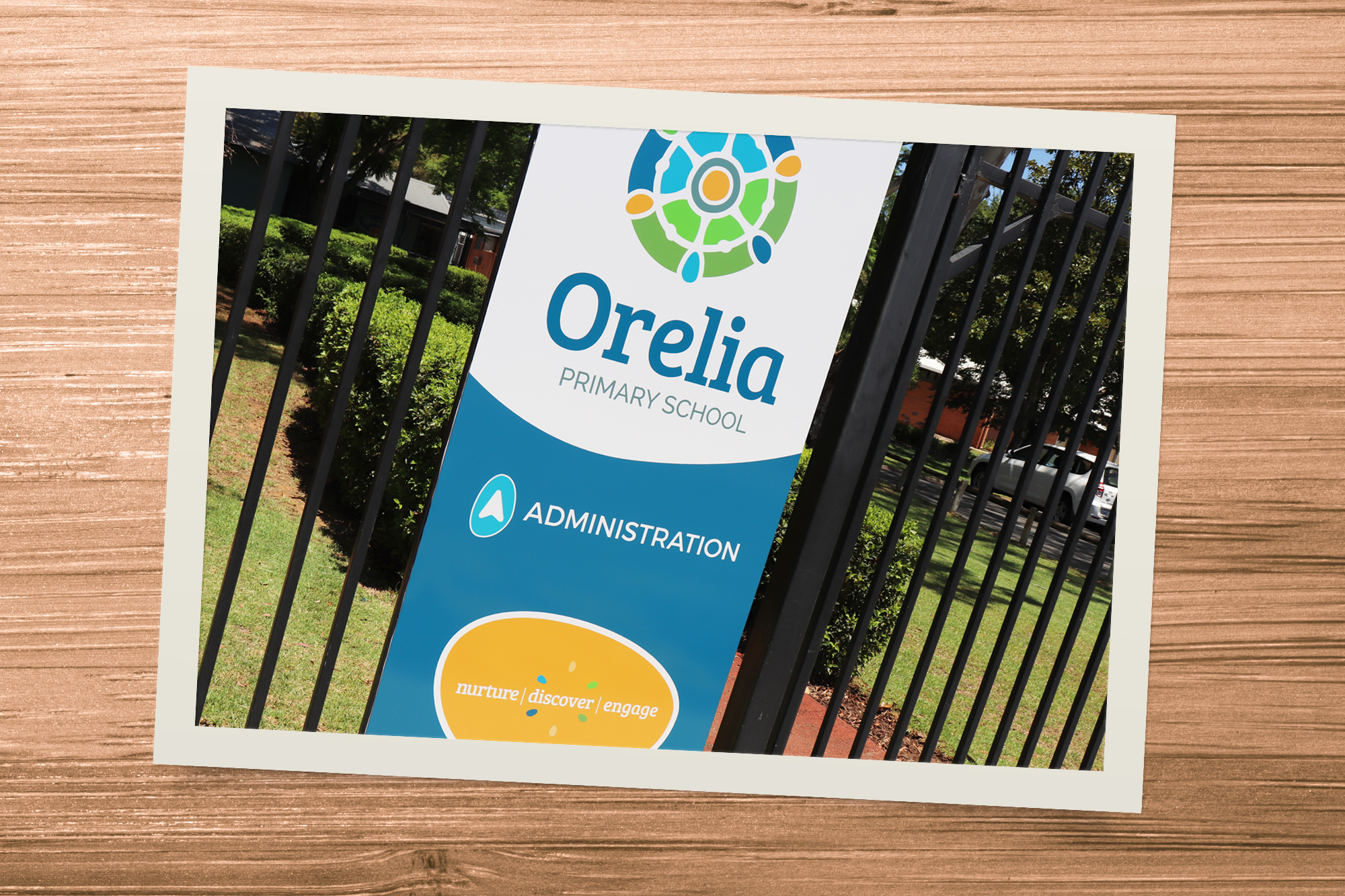
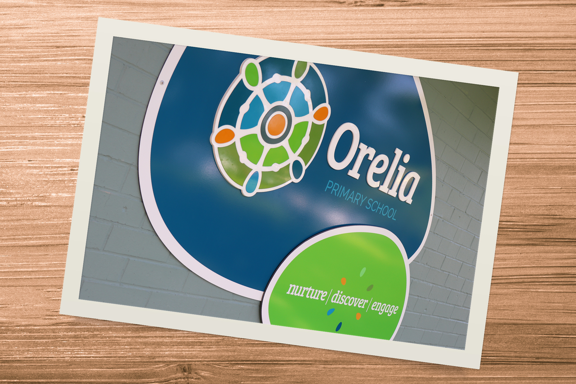
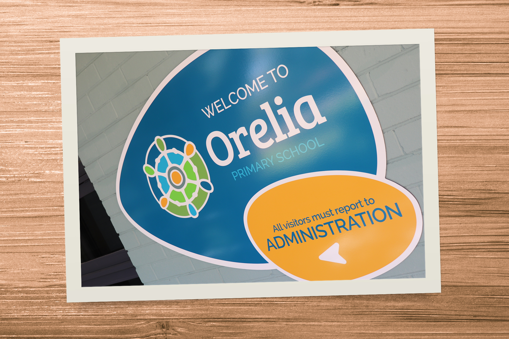
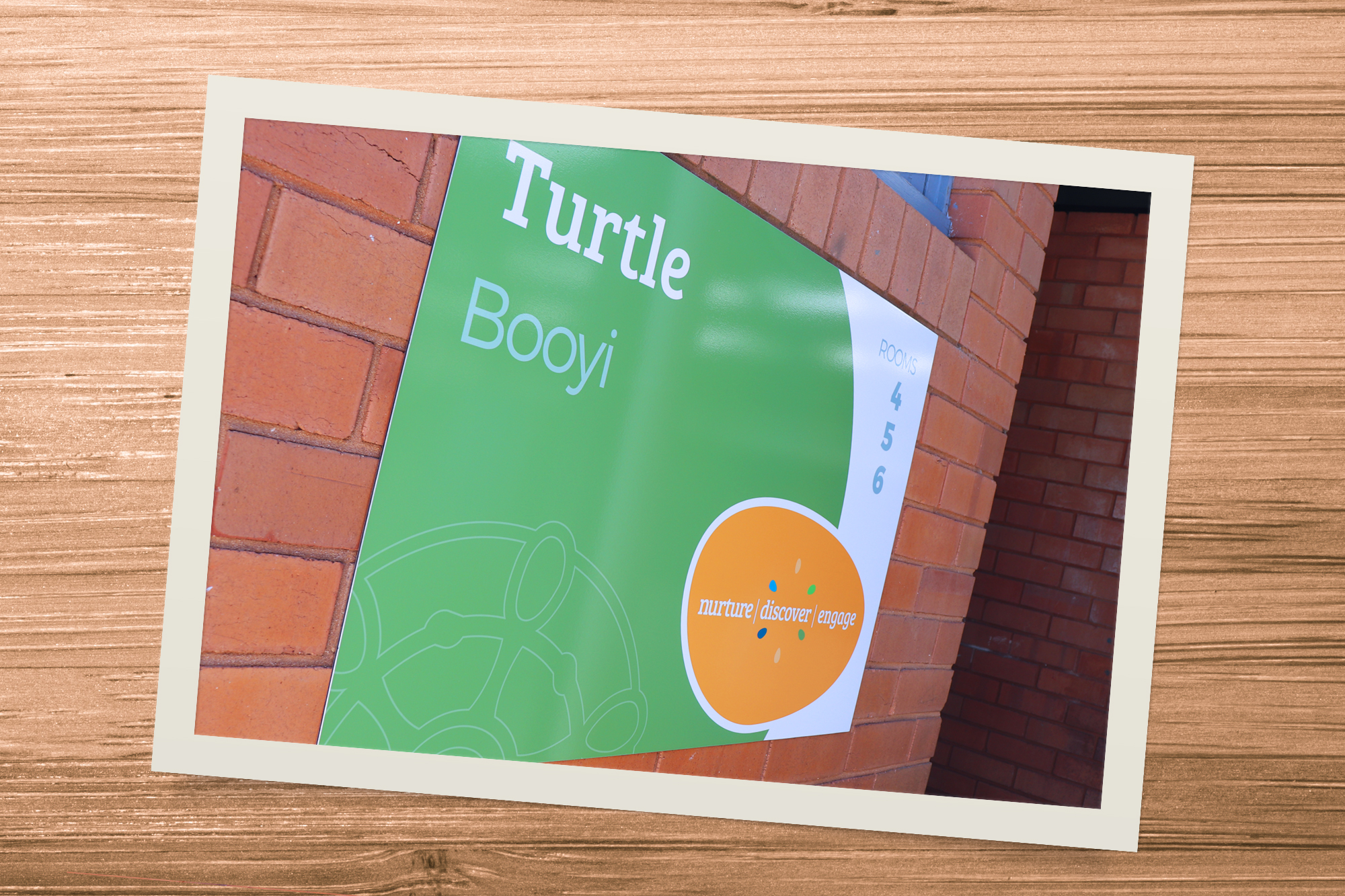
Since completing the brand Gumption has assisted in developing a range of supporting brand touchpoints including comprehensive signage around the school.