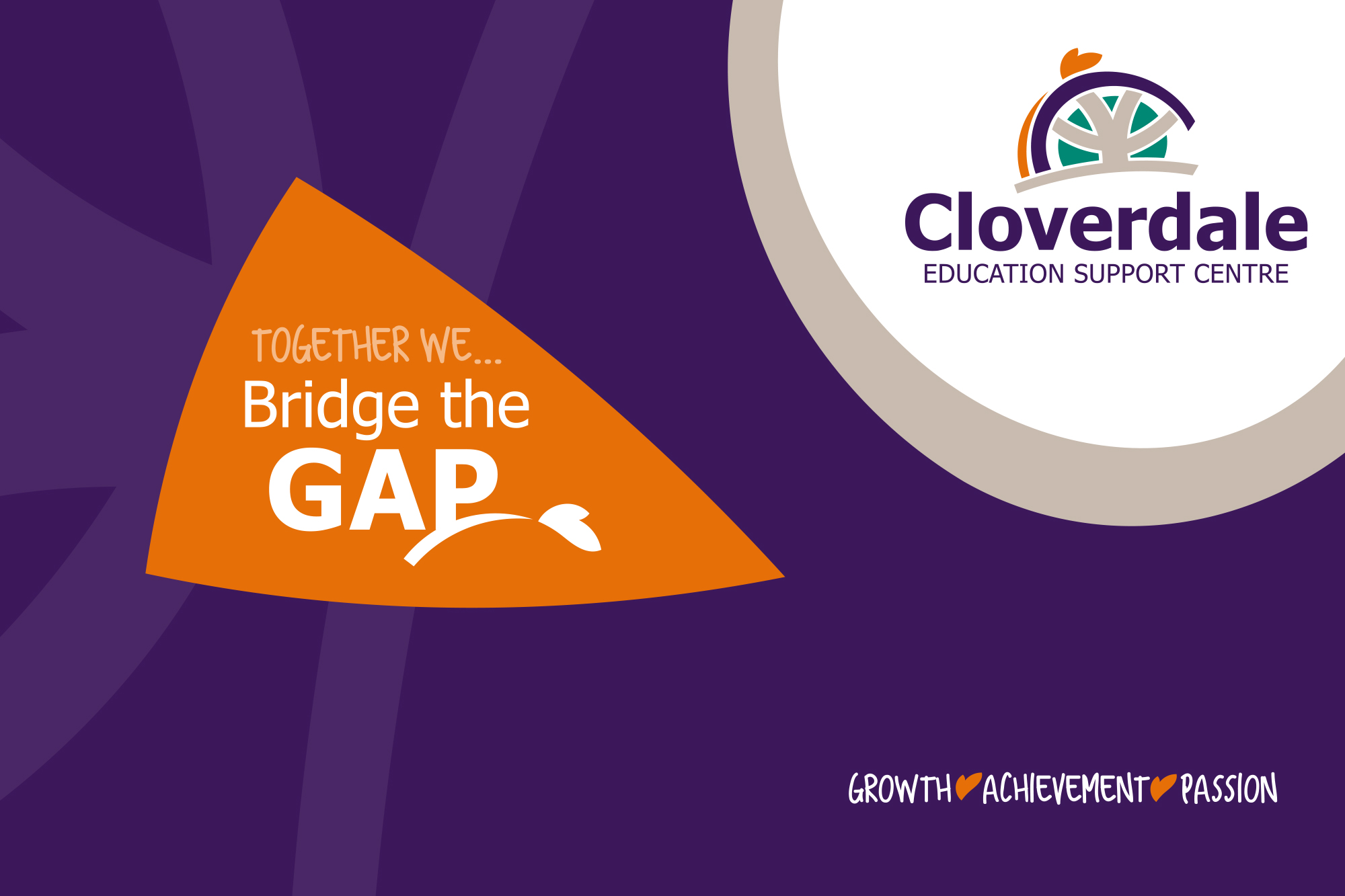
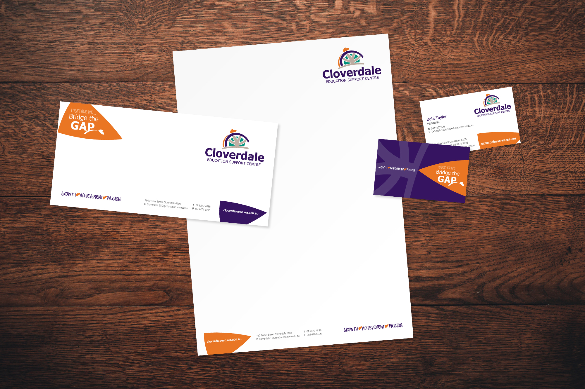
Cloverdale Education Support Centre (CESC) caters for primary-aged students with special needs. Gumption was commissioned to create a clear identity to show the school aims to develop the whole person engendering a positive self-image and independence in daily life.
The brand solution is friendly and energetic with all elements interacting together to tell a story. The central shape represents the pathways that all students have in life, with the circle representing parent and community support. The pathways continue beyond the available support acknowledging students need a little more assistance to reach their greatest potential. The purple bridge symbolises Cloverdale ESC’s involvement in students’ lives by creating a smooth pathway allowing a more supported journey. This journey is symbolised by the orange arc, with the orange shape representing the student now ready to unfurl their wings and fly into the world.